-
Some Pictures of US Federal Debt
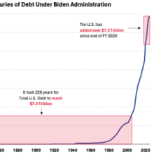
Senatorial candidate Hovde presents this picture: chart Source: Hovde. I’ll trust that the candidate’s staff did the adding correctly, although I think the calculation is pretty meaningless. For instance, how does individual colony debt in 1776 get counted? More substantively, does it make sense to report nominal debt over such a long period?* I think maybe nominal debt divided by nominal GDP makes more sense. chart Figure 1: Gross Federal debt, as a percentage of GDP (blue). Note end-FY gross debt as a percentage of calendar year GDP. Orange shading denotes mostly Trump administration (FY2016-FY2020 debt). ... (full story)
- Comments
- Subscribe
-
- Older Stories
 From fxstreet.com|Mar 6, 2024
Gold price (XAU/USD) edges lower during the Asian session on Wednesday and reverses a part of the previous day's positive move back closer to the all-time high reached in December ...
 From fxempire.com|Mar 6, 2024
Gold reached a record high on Tuesday, driven by expectations of U.S. monetary easing and ongoing geopolitical risks, attracting momentum-driven funds. The demand is further ...
 From forexlive.com|Mar 5, 2024
Reserve Bank of New Zealand chief economist Conway spoke on a webinar hosted by an asset management firm on Wedneday. Earlier headlines are here: • RBNZ Chief Economist says ...
-
- Newer Stories
 From destatis.de|Mar 6, 2024
In January 2024, German exports were up by 6.3% and imports by 3.6% on a calendar and seasonally adjusted basis compared with December 2023. Based on provisional data, the Federal ...
 From @cablefxmacro|Mar 6, 2024|10 comments
post: <JPY=>:

 SOME BOJ POLICING MEETING ATTENDEES ARE LIKELY TO SAY THAT LIFTING THE NEGATIVE INTEREST RATE IS REASONABLE: JIJI
 From @C_Barraud|Mar 6, 2024
post:
 #CHINA 'S PAN: SEE ROOM FOR RRR TO FALL FURTHER - BBG post: CHINA CENTRAL BANK GOVERNOR: MONETARY POLICY WILL PROMOTE MILD REBOUND IN CONSUMER PRICES CHINA CENTRAL BANK GOVERNOR: WILL SET UP RELENDING FACILITY FOR TECH INNOVATION CHINA CENTRAL BANK GOVERNOR: WILL KEEP THE YUAN BASICALLY STABLE
- Story Stats
- Posted: Mar 6, 2024 1:38am
- Submitted by:Category: Fundamental AnalysisComments: 0 / Views: 2,814